How TO – CSS Loader & HTML Learn how to create a preloader with CSS
Here’s a well-structured English article about creating CSS loaders without code explanations:
How to Create Stylish CSS Loaders for Your Website
Preloaders (or loading animations) provide visual feedback while users wait for content to load. Modern websites use creative CSS animations to keep visitors engaged during brief loading times.
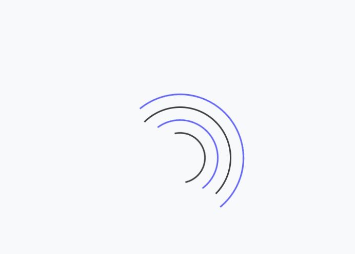
The Classic Spinner
The most recognizable loader features a spinning circle with a color gradient. This timeless design works well for both minimalist and content-rich sites.
Bouncing Dots Variation
For a playful touch, many developers implement a sequence of bouncing dots. The cascading animation creates a sense of movement and progress.
Progress Bar Style
Linear loaders work particularly well for pages with predictable load times. The sliding animation gives users a sense of how much longer they need to wait.
Modern Alternatives
Contemporary designs incorporate:
- Pulse animations
- Morphing shapes
- Gradient transitions
- Skeleton screens
Implementation Tips
- Keep animations smooth and lightweight
- Use complementary brand colors
- Ensure proper contrast for visibility
- Match the loader style to your site’s personality
When to Use Loaders
- Content-heavy pages
- Image galleries
- Dashboard interfaces
- Single-page applications
Performance Considerations
Well-designed CSS loaders typically add minimal overhead. For best results:
- Optimize animation performance
- Use hardware-accelerated properties
- Consider reduced motion preferences
The right loading animation can turn waiting time into an engaging moment that reflects your brand’s identity while improving perceived performance.
.loader { border: 16px solid #f3f3f3; border-radius: 50%; border-top: 16px solid blue; border-bottom: 16px solid blue; width: 120px; height: 120px; -webkit-animation: spin 2s linear infinite; animation: spin 2s linear infinite; } @-webkit-keyframes spin { 0% { -webkit-transform: rotate(0deg); } 100% { -webkit-transform: rotate(360deg); } } @keyframes spin { 0% { transform: rotate(0deg); } 100% { transform: rotate(360deg); } }
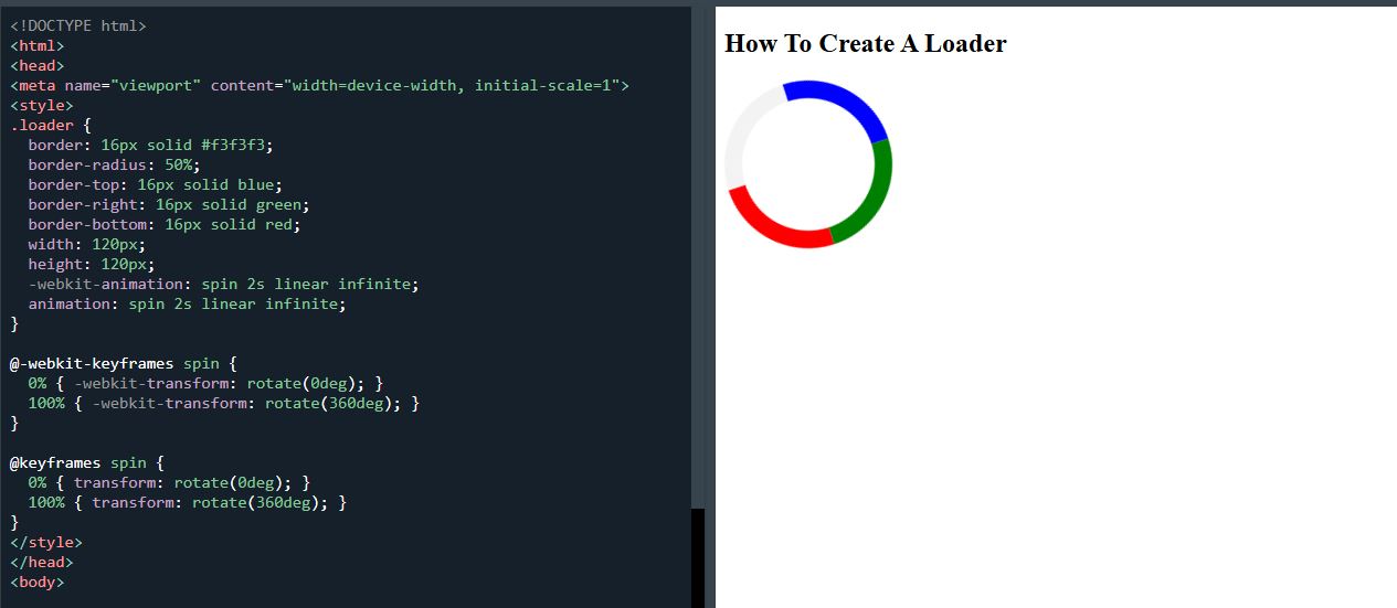
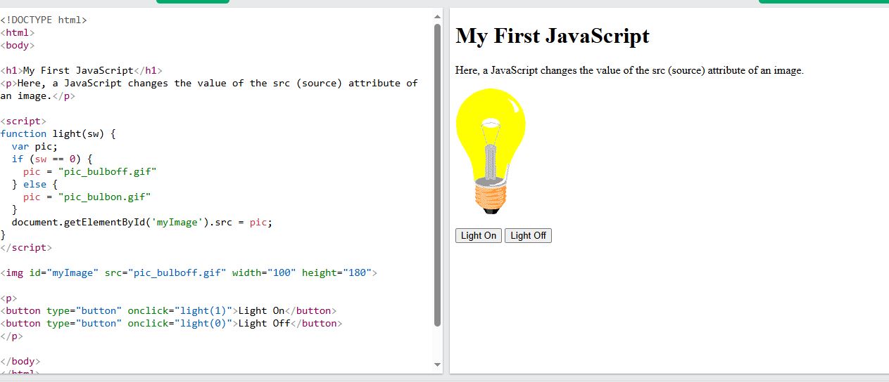
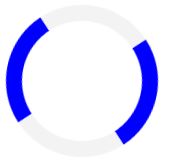
How To Create A Loader
<!DOCTYPE html>
<html>
<head>
<meta name="viewport" content="width=device-width, initial-scale=1">
<style>
.loader {
  border: 16px solid #f3f3f3;
  border-radius: 50%;
  border-top: 16px solid blue;
  border-bottom: 16px solid blue;
  width: 120px;
  height: 120px;
  -webkit-animation: spin 2s linear infinite;
  animation: spin 2s linear infinite;
}

@-webkit-keyframes spin {
  0% { -webkit-transform: rotate(0deg); }
  100% { -webkit-transform: rotate(360deg); }
}

@keyframes spin {
  0% { transform: rotate(0deg); }
  100% { transform: rotate(360deg); }
}
</style>
</head>
<body>

<h2>How To Create A Loader</h2>

<div class="loader"></div>

</body>
</html>