Animated Multi-Circle Loading Spinner: HTML & CSS Implementation
The Art of Animated Loading: A Visual Journey Through CSS Animation
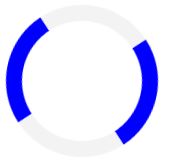
In the digital realm where microseconds feel like eternity, a mesmerizing dance of concentric circles emerges – not merely as a loading indicator, but as a carefully choreographed performance of web animation. Four perfect rings materialize on screen, each moving in harmonious discord, their staggered rotations creating a hypnotic rhythm that transforms the frustrating wait into a visual spectacle.
The largest circle, a vibrant indigo band, begins its graceful arc first, its color reminiscent of twilight skies. Moments later, a smaller charcoal-gray ring joins the ballet, its movement precisely timed to create a wave-like effect. The sequence continues with alternating indigo and gray circles, each subsequent ring tighter than the last, like ripples reversing their flow in some digital pond.
What appears as simple rotation reveals intricate craftsmanship. Each circle maintains perfect geometric precision through the magic of border-radius, while strategically colored borders (only the top and right edges visible) create the illusion of semi-transparent ribbons chasing each other through space. The animation breathes with natural momentum – accelerating through its initial movement, then gently decelerating as it completes each revolution, thanks to the elegant ease-in-out timing function.
The negative animation delays work like skilled orchestra conductors, ensuring each visual instrument enters at precisely the right moment. This creates a cascading effect where circles appear to both lead and follow simultaneously, their phases locked in perpetual motion. The entire composition floats serenely at the center of the viewport, unaffected by the chaos of responsive layouts or device orientations.
This is no ordinary loading spinner – it’s a miniature kinetic sculpture that demonstrates how fundamental CSS properties, when combined with thoughtful design, can transcend their utilitarian purpose. The alternating color scheme provides visual depth, while the increasing negative delays (-0.15s, -0.3s, -0.45s, -0.6s) produce an undulating rhythm that’s pleasing to the eye yet subtle enough not to distract.
As the circles complete their endless rotation cycle every three seconds, they embody the paradoxical nature of digital interfaces – simultaneously communicating progress through movement while existing outside linear time. The animation becomes a visual metaphor for the processing happening behind the scenes, its smooth transitions reassuring users that their wait is both acknowledged and temporary.
In an age of instant gratification, this animated loader reminds us that even transitional moments can contain beauty. It transforms the necessary evil of waiting into a moment of visual poetry, proving that functional elements need not be purely utilitarian, but can elevate the user experience through thoughtful motion design.
#loader { width: 100%; height: 100vh; display: flex; align-items: center; justify-content: center; background-color: #f8f9fa; } .circle-loader { display: flex; align-items: center; justify-content: center; position: relative; width: 250px; height: 250px; } .circle { position: absolute; border: 3.5px solid transparent; border-radius: 50%; animation: rotate 3s infinite ease-in-out; } .circle-1 { width: 250px; height: 250px; border-top-color: rgb(99, 102, 241); border-right-color: rgb(99, 102, 241); animation-delay: -0.15s; } .circle-2 { width: 200px; height: 200px; border-top-color: #404041; border-right-color: #404041; animation-delay: -0.3s; } .circle-3 { width: 150px; height: 150px; border-top-color: rgb(99, 102, 241); border-right-color: rgb(99, 102, 241); animation-delay: -0.45s; } .circle-4 { width: 100px; height: 100px; border-top-color: #404041; border-right-color: #404041; animation-delay: -0.6s; } @keyframes rotate { 50% { transform: rotate(360deg); } } .timer-text { position: absolute; font-size: 48px; color: black; }<!DOCTYPE html>
<html lang="ar" dir="rtl">
<head>
<meta charset="UTF-8">
<meta name="viewport" content="width=device-width, initial-scale=1.0">
<title>Loader </title>
<style>
#loader {
width: 100%;
height: 100vh;
display: flex;
align-items: center;
justify-content: center;
background-color: #f8f9fa;
}
.circle-loader {
display: flex;
align-items: center;
justify-content: center;
position: relative;
width: 250px;
height: 250px;
}
.circle {
position: absolute;
border: 3.5px solid transparent;
border-radius: 50%;
animation: rotate 3s infinite ease-in-out;
}
.circle-1 {
width: 250px;
height: 250px;
border-top-color: rgb(99, 102, 241);
border-right-color: rgb(99, 102, 241);
animation-delay: -0.15s;
}
.circle-2 {
width: 200px;
height: 200px;
border-top-color: #404041;
border-right-color: #404041;
animation-delay: -0.3s;
}
.circle-3 {
width: 150px;
height: 150px;
border-top-color: rgb(99, 102, 241);
border-right-color: rgb(99, 102, 241);
animation-delay: -0.45s;
}
.circle-4 {
width: 100px;
height: 100px;
border-top-color: #404041;
border-right-color: #404041;
animation-delay: -0.6s;
}
@keyframes rotate {
50% {
transform: rotate(360deg);
}
}
.timer-text {
position: absolute;
font-size: 48px;
color: black;
}
</style>
</head>
<body>
<div id="loader">
<div class="circle-loader">
<div class="circle circle-1"></div>
<div class="circle circle-2"></div>
<div class="circle circle-3"></div>
<div class="circle circle-4"></div>
</div>
</div>
</body>
</html>