HTML & CSS
Neumorphic Loading Animation
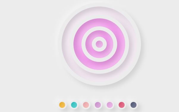
This code creates an attractive visual design consisting of four animated nested rings with a color picker tool.
Key Components:
- Animated Rings:
- Four nested circular rings with a 3D-like effect.
- Each ring has a different size and gradually changes color in a sequential rhythm.
- Uses
box-shadowto create a realistic lighting and shadow effect.
- Color Picker Tool:
- Seven small circles with different colors (gold, teal, pink, purple, etc.).
- Clicking any color changes the rings’ colors to match.
- Dynamic Interaction:
Visual Effect:
- The design resembles a series of light waves radiating from the center outward.
- Colors transition smoothly, creating a dynamic and interactive feel.
Potential Use Cases:
- Can be used as a decorative UI element in web interfaces.
- Suitable for loading screens, gaming pages, or creative applications.
Summary: An elegant and dynamic design combining smooth animations with interactive color-changing effects.
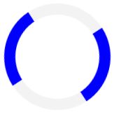
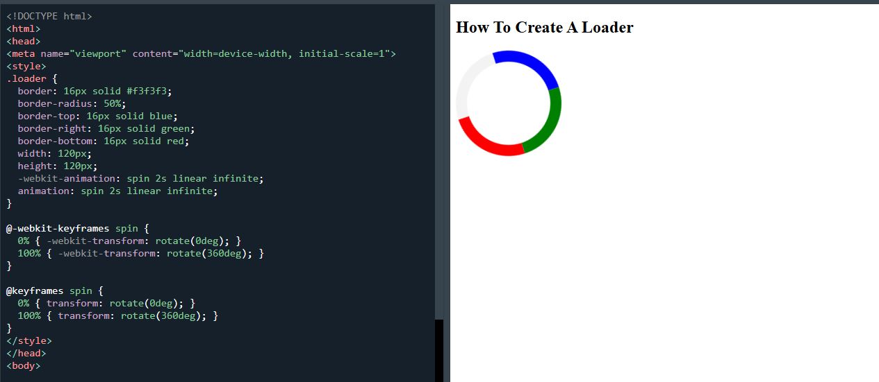
.loader { border: 16px solid #f3f3f3; border-radius: 50%; border-top: 16px solid #3498db; width: 120px; height: 120px; -webkit-animation: spin 2s linear infinite; /* Safari */ animation: spin 2s linear infinite; } /* Safari */ @-webkit-keyframes spin { 0% { -webkit-transform: rotate(0deg); } 100% { -webkit-transform: rotate(360deg); } } @keyframes spin { 0% { transform: rotate(0deg); } 100% { transform: rotate(360deg); } }How To Create A Loader
<!DOCTYPE html>
<html>
<head>
<meta name="viewport" content="width=device-width, initial-scale=1">
<style>
.loader {
  border: 16px solid #f3f3f3;
  border-radius: 50%;
  border-top: 16px solid #3498db;
  width: 120px;
  height: 120px;
  -webkit-animation: spin 2s linear infinite; /* Safari */
  animation: spin 2s linear infinite;
}

/* Safari */
@-webkit-keyframes spin {
  0% { -webkit-transform: rotate(0deg); }
  100% { -webkit-transform: rotate(360deg); }
}

@keyframes spin {
  0% { transform: rotate(0deg); }
  100% { transform: rotate(360deg); }
}
</style>
</head>
<body>

<h2>How To Create A Loader</h2>

<div class="loader"></div>

</body>
</html>